My 3 options for which magazine i would do were: HYPEBEAST, i-D and Highsnobiety as all these magazines focus on youth culture and fashion.
I decided to do i-D as the other options were heavily focused on Brands and Fashion whereas i-D was focused more on the individual and their identity which was being represented in a single frame.
1) In your blogpost, write your main cover line (also called the 'main flash') - this is the main cover story that links to your central image. It must be 100% original - all your own words.
From my research I've found that i-D magazines don't usually have a main cover line and instead they focus on the image and the contents of the magazine.
2) Briefly plan the image you will need for the cover - model, costume, make-up, lighting etc. At this point, simply describe the image you need to capture.
A full body shot photo focused on the outfit and a wide shot to show the setting.
3) Write the cover lines and any additional text you need for your magazine cover.
For my text I'm taking a a more humorous approach and decided to make the names and the contents centred around how amazing I am. I did this by using the text in the top right where it usually discusses models/the names of people the magazine stories are focused on to write my own name multiple times: "The amazing Dennis" "The Iconic Dennis". Then for the contents information I followed the same idea by focusing all the stories on me: "Why Denis is so amazing" "Why 2007 is the greatest year in all of history (Dennis was born)".
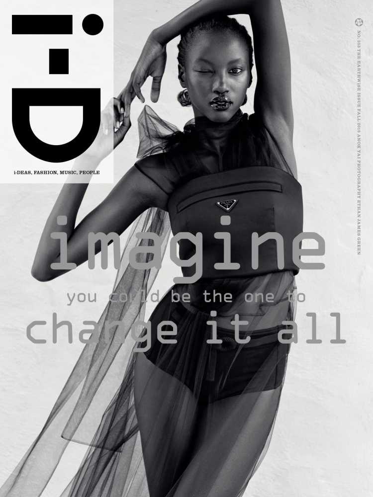
As I wasn’t able to do a photoshoot I had to improvise and find a picture which matched the magazine I had chosen. I chose this image because i believe it reflects youth culture with the city background and the outfit being the focus.
I believe I did well with what I had to work with and the cover i made isn’t exactly perfect but i do think it looks somewhat professional. I took certain aspects from different existing cover i saw such as the teared paper effect to uncover big names included in the magazine and having an insight into the contents on the left which i saw on majority of the existing covers. I tried to use the same fonts as the originals but I had to settle for something similar as I wasn’t able to find them.
If I had to do this practical again I’d have waited and used the in school equipment to do a photoshoot as I believe that would’ve made my work look much more professional and it would’ve allowed me to be more creative with my editing and let me choose where I want to place things. This is because the magazine logo is usually on the left in the real magazines but with my image it had to go on the right to not make the left too crowded and cover up the image.